
Selected Project
WHAT IS RESOLVE?
reSOLve is a mobile application designed to help address Nomophobia, which is the fear of being separated from or unable to use one's smartphone. It does this by limiting the amount of time users can spend on their most used apps, and switching those apps from a color display to greyscale once the allotted time has been reached. Users can complete a mindful activity provided by reSOLve to consciously spend time not using their device to add more time back to their daily limit.
SITUATION
TIMELINE
Fall 2019
10 weeks
CONTEXT
MHCI+D program at
University of
Washington
Ideation Studio
TEAM
Jeff Rosen
Yagmur Erten
Vanshika Swaika
MY CONTRIBUTIONS
UX researcher
Research analyst
Project manager
Physical prototyping
Usability tester
Prototyping insight analyst
Video editor
Report writer
DELIVERABLES
High fidelity prototype of
design idea
Cultural probe
Usability tests
OBJECTIVE
THE TASK
-
Design a solution to an issue involving mental health which in some way incorporates interactive technology
-
Identify target user base and severity of mental health problem on our own
-
Create a high fidelity prototype of our design solution, along with justification for each of its features
-
Justify design decisions via a cultural probe, which was to be completed by members of target user base
THE TEAM
-
Randomly assigned to teams of three with two fellow members of the MHCI+D cohort
-
Varied skill sets and backgrounds across each team member
-
Each of us had to explore and develop skills outside of what we already knew in order to meet deliverables
THE CHALLENGE
How might we help people experiencing Nomophobia to be mindful of their smartphone usage and provide them with a way to reduce it, without hindering their productivity or connectivity?
THE PROJECT
reSOLve
The solution to the challenge took the form of a phone application that would aim to curb its users' need to constantly be on their phones in a way that didn't entirely remove their ability to access them. Recognizing the importance of smartphones in today's society as well as the design of other Nomophobia apps simply locking users out of their device, we wanted to make a solution that could address this mental health problem without impeding the ability to use the phone.
To accomplish this task, reSOLve works as follows:

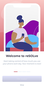
Informs its user about how the app functions and what it hopes to achieve.

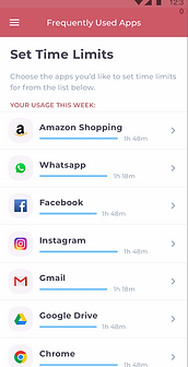
Users set time limits for their most used apps to track their daily use.

When the limit is reached, the app switches to a greyscale display.

Research showed us that people are less likely to use their devices if they don't have color.

Users add more time to their daily limit by completing a mindful activity
RESEARCH
Created a cultural probe in the form of a small diary with relevant questions. Participants answered the questions at different intervals and tracked their smartphone usage.


The cultural probe, which took the form of a diary with a series of questions to be completed by the participants over the course of a full day and the following morning
Several key insights emerged:
People were checking their smartphone very frequently when they felt they had notifications
People were uncomfortable with the idea of being without their smartphone
Upon returning the probe, many participants expressed a willingness to curb their smartphone usage
IDEATION
Ideation generated 90 design concepts to address the problem space. These were grouped and assessed by feasibility, relevance and practicality. The idea of breathing calmly as a solution to smartphone related stress was appealing. Each of these ideas targeted different aspects of the problem space: an overabundance of notifications, a desire to spend a long time using the smartphone and the stress felt when the device is close to running out of battery.
From these 90, three design concepts rose to the top:
Concept 1
A notification system where users can prioritize certain notifications over others, which will hide the non-priority ones until the user takes a moment to calmly breathe into the phone to unlock it.
Concept 2
An app where users set time limits for some of their other apps, and when that time limit is reached the app shifts to greyscale. The user can then calmly breathe into their phone to add more time to the app's limit.
Concept 3
A device that would allow users to charge their phone by calmly breathing into an attachable device, but only when the phone was low on battery and close to dying.

Concept 1 - Notification filter

Concept 2 - Greyscale

Concept 3 - Charging device
CONCEPT
TESTING
Conducted four prototyping tests for each of the three design concept prototypes. Also tested an alternative design for the charging device concept, which used a fidgeting tool, to gauge participants' reactions to solutions other than breathing.

Prototype 1 - Notification filter

Prototype 3 - Charging device, breathing
Tests consisted of participants being informed about the design challenge, then presented with the first screen of the first prototype. They were then asked to vocalize their thoughts and logic behind each decision they made as they navigated through each screen. Guidance was only provided if they had no idea about how to progress.
A short discussion followed each prototype before moving onto the next.
Participants received a physical object that represented the third design prototypes. These tests were mostly discussion and a demonstration of how the user thought they'd use the devices.

Prototype 2 - Greyscale

Prototype 3.5 - Charging device, fidget mechanic

Prototype 1 user flow

Prototype 2 user flow

Prototype 3 user flow

Prototype 3.5 user flow
Several key insights emerged:
Breathing into the phone felt very awkward, should feel more natural and not forced.
Participants interpreted "breathing" to mean forcefully blowing into the microphone.
Participants would feel comfortable using the fidget device rather than using their smartphone.
Participants wouldn't feel stressed about receiving many "non-priority" notifications.
Instructions to go back to the app for the greyscale design should be made more clear.
Participants' feedback indicated that the greyscale concept was the most likely to influence how much they used their smartphone, and they liked that they could choose to bring the color back if they wanted. As the premise of breathing to reduce stress was poorly received, the mindful activities were implemented as an alternative solution.
FUTURE DESIGN DECISIONS
-
Our solution to our design challenge utilized some speculative interactive technology that we could not fully implement with today's limitations .
-
Greyscale functionality on smartphones is typically doable only as part of the device's OS.
-
Design justification had to be explained for how it could be implemented further down the line, such as by eventually building reSOLve into the OS, which was a great opportunity to consider how to design across a product's projected timeline post-launch.
LOOKING BACK / MOVING FORWARD
ADAPTING TO REJECTION
-
The breathing concept our team liked so much was largely rejected by basically all participants.
-
With limited time remaining in the project timeline, we had to quickly adapt and determine how to come up with something new that still matched our proposed design solution.
-
Valuable opportunity to take a close look at all our testing feedback and create creative solutions with most positive aspects of each concept.
RECOVERING FROM PIVOT
-
The first two and a half weeks of our project timeline were actually spent working on a completely different design challenge, revolving around financial stress.
-
All research pointed to a lack of opportunity spaces for us to design for this problem, requiring us to hard pivot to a new topic.
-
With careful planning and consideration, we were able to determine a new problem space and re-complete each deliverable from the two and a half weeks spent on our last concept in less than a week.